Vintesa - United organic winemakers
Vintesa is the oldest consortium of organic winemakers in Italy. So many different producers and terroir, from North to South, with a just unique philosophy: respecting nature above all. This strong sense of professional ethic reflect the unique personality of each producers and his own wines.
This case study is about a complete restyling of the perception of brand; including
a more peculiar look and style guide, and a consistent application across marketing tools and touchpoint, both digital and real.
Logo restyling. Handwritten original calligraphy.
Brand Key Visual definition and visual translation.
Corporate Business Cards
Art direction and visual iconography style study.
Foldable wine journal. Front page and manifesto
Foldable wine journal. Internal full catalogue.
Convertible wine journal into wineshop manifesto advertising
winemakers portrait shooting and cover
Wine catalogue templates study with brand color customization and wine personality.
Vintesa key visual adaptation
Corporate website. Please visit: www.vintesa.wine
Responsive website extended layouts.
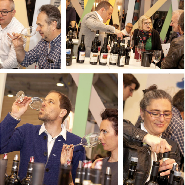
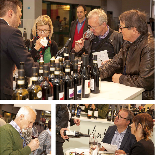
wine tasting experience flyer @ Vinataly fair
Promo poster for internatinal wine fair
Work in progress paint for wineshop. Acrylic on wood 100x150
Wine tour poster. 50x70


